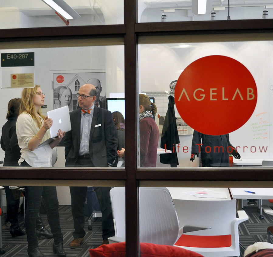
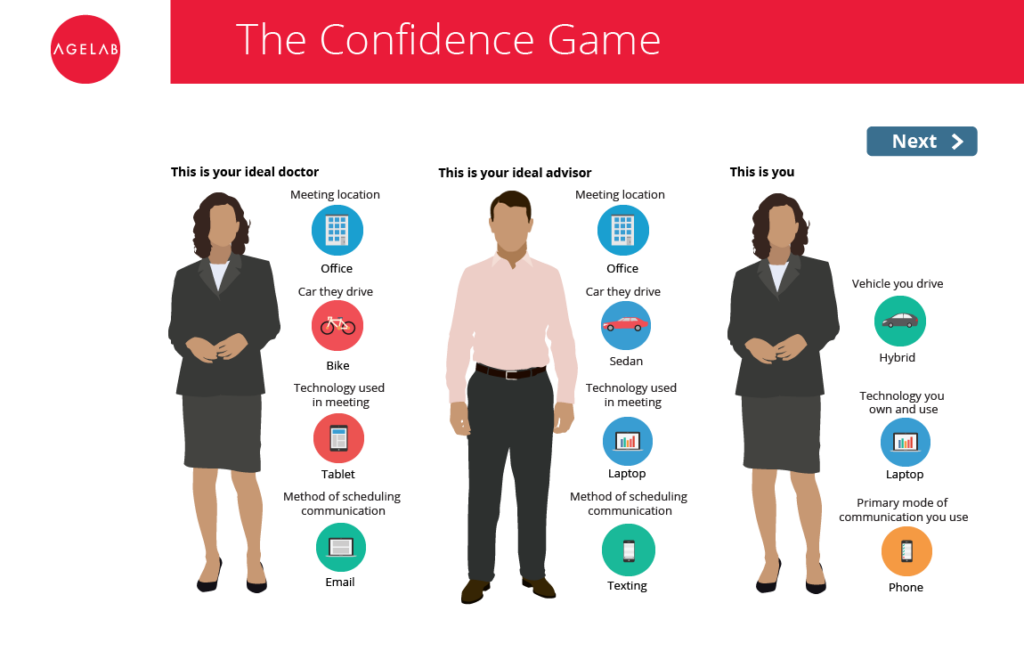
Input from researchers and target audiences emphasized that approachability, simplicity, portability, and recognizability were critical—which led us to this simple shape. Red, gray, and black palette? MIT colors. Modified Futura gave us the easy-to-read geometric typeface that made the logotype come together. We have designed websites, online games, annual reports, research reports, conference materials, and much more for AgeLab, and the brand we created has grown to be ubiquitous in the field, and among the most recognizable in the MIT multiverse.

